In 2020 I introduced my news crawler and news processing in a blog post. In the last months I made some improvements I want to describe in this update, including an updated python pipeline, more crawled news website and improved plots.
Title Image by: AbsolutVision on Unsplash
In the following short introduction to the topic I want to show how easy news headlines can be crawled, present approaches to data preparation and produce some plots showing important news topics and the development throughout the past couple of years. We find some interesting insights from time series and from the comparative approach between websites. Looking back to my original blog post I continued the observation of Covid in news headlines and show other important topics incl. the war in Ukraine.
 Photo by Jackson Sophat on Unsplash
The Crawler
My crawler is now completely written in Python, automated with cron on my linux machine. To be precise I have three crawlers running, one is experimenting with hourly news updates, one is an update on the originally presented srf.ch crawler and the third one is a daily crawler on three important news websites in Switzerland and Germany. srf.ch, tagesanzeiger.ch and tagesschau.de can now be compared according to the relevance of specific topics in their news headlines. srf.ch is the main news website of Schweizer Radio und Fernsehen SRF (English: Swiss Radio and Television), a Swiss broadcasting company. tagesschau.de is the main news website of ARD, a joint organization of Germany’s regional public-service broadcasters. tagesanzeiger.ch is the website of Tagesanzeiger, a swiss national daily newspaper, which is used to be contrasted with topics in public news services of SRF and ARD.
The following Python code shows an example of crawling the srf.ch website. I focus on headlines

import pandas as pd
import requests
from bs4 import BeautifulSoup
import time
from datetime import date, timedelta
from sqlalchemy import create_engine

todaysdate = time.strftime("%d-%m-%Y")

URL = 'https://www.srf.ch/news'
page = requests.get(URL, verify=False)

html_soup = BeautifulSoup(page.text, 'html.parser')

teaser_all = html_soup.find_all('div', class_ = 'teaser__content')

nameList = [i.text for i in teaser_all]
alles = pd.Series(nameList, name="text")
alles = alles.to_frame()
alles['type'] = 'alles'

frames=[alles]
srf = pd.concat(frames)
srf = srf.reset_index(drop=True)
srf['provider'] = "srf"
srf['date'] = todaysdate
As a result you will get the news headlines from the teaser class crawled from srf.ch. The data will look like this and is ready to be processed.

The Processing
After running the short Python script from above we have all the news headlines from srf.ch. We can store them in a format we like, build an automatic script run in a tool we prefer and stack one dataframe after another day by day (hour by hour) to build up a collection of news data. The first step in processing the raw data is to eliminate duplicates, so we have only freshly provided news headlines per day (hour). After that we have all the headlines ready for working with specific news topics. Next step is to build topic dictionaries including several words or parts of sentences belonging to a specific topic i.e. Covid. All trigger words can be applied on the teaser elements, we search for them in every line of news headers in the data frame resulting from the first step.
searchfor = ['corona', 'virus', 'virolog', 'sars', 'covid', 'maskenpflicht', 'delta-variante',
                       'Massnahmengegner', 'Robert Koch', 'moderna', 'biontec', 'sputnik', 'astra zeneca',
                       'omikron', 'omicron', 'booster', 'testpflicht', 'curevac', 'vakzin', 'covax']

covid_list = covid['col'].tolist()
df_topics['covid'] = np.where(df_topics['text'].str.contains('|'.join(covid_list), regex=True, case=False, na=False), 1, 0)
Last step of data processing is to calculate the percentage of tagged topics (Covid) to the total of crawled news headers per time period you wish to analyze - hourly, daily, weekly, monthly or yearly bundles of news headers. From that percentage we can analyze how many of the crawled news headlines included the topic Covid compared to the total number of news headlines - per desired time period.
df_output_month = df_output.copy()
df_output_month['month'] = df_output_month['date'].dt.month
df_output_month['year'] = df_output_month['date'].dt.isocalendar().year
df_output_month['month'] = df_output_month['year'].astype(str) + df_output_month['month'].astype(str).apply(lambda x: x.zfill(2))
del df_output_month['date']
del df_output_month['year']
df_output_month = df_output_month.groupby(['month', 'provider']).sum()
df_output_month = df_output_month.reset_index(level=['month', 'provider'])

df_output_month_perc = df_output_month.copy()
df_output_month_perc['total'] = df_output_month_perc.apply(lambda x: x.iloc[2:].sum(), axis=1)
df_output_month_perc = round(df_output_month_perc.iloc[:, 2:].div(df_output_month_perc['total'], axis=0) * 100, 0)
del df_output_month_perc['total']

df_output_merge = df_output_month[['month', 'provider']]
df_output_month_perc = pd.merge(df_output_merge, df_output_month_perc, left_index=True, right_index=True)
The resulting dataframe will look like this and is ready to be used for visualization.

In the last part of this blog we use some matplotlib and seaborn to see how the Covid headline will develop over the years. In 2020 I was curious for how long corona news will dominate the timeline and what other important topics will appear. Let’s see what happend since the last blog post.
Data Visualization Part I
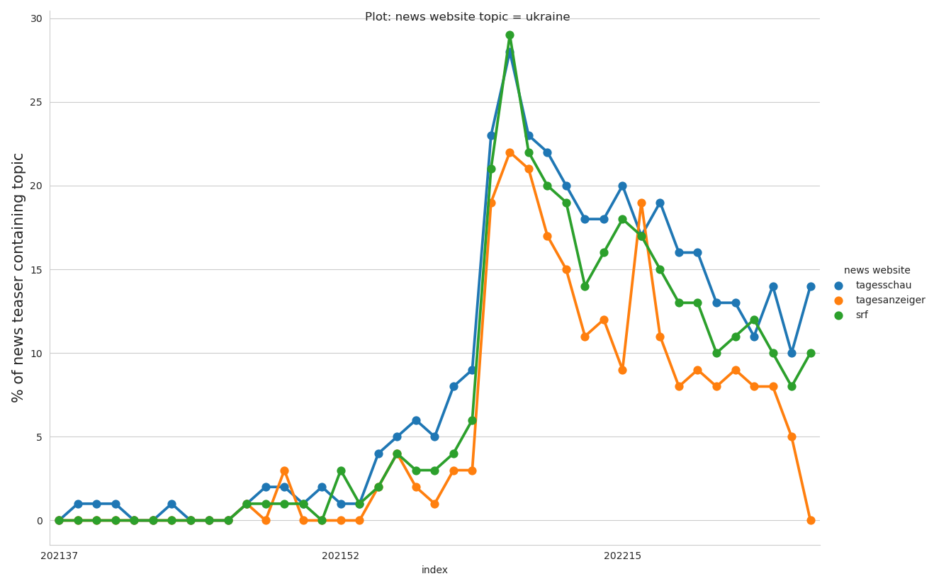
First we can start to build our time series plot to compare our set of news providers. The function above will help you build a line plot comparing one topic between our crawled news providers for the selected time period - days, weeks or months. This new type of analysis is possible since late 2021 when I extended my web crawler for 3 news websites. Shortly after war in Ukraine started. Let’s see what we can learn from the plot below.
def plot_topic_by_provider(topic, date):
    """
    Plot selected topic by date element comparing news providers

    """

    # from datetime import datetime
    df_output_week_perc['Jahr'] = df_output_week_perc["week"].str.slice(0, 4)
    df_output_week_perc['Woche'] = df_output_week_perc["week"].str.slice(4, 6)
    df_output_week_perc['Week'] = pd.to_datetime(df_output_week_perc['Woche'].astype(str) +
                                                 df_output_week_perc['Jahr'].astype(str).add('-1'), format='%V%G-%u')
    df_output_month_perc['Jahr'] = df_output_month_perc["month"].str.slice(0, 4)
    df_output_month_perc['Monat'] = df_output_month_perc["month"].str.slice(4, 6)
    df_output_month_perc['Month'] = pd.to_datetime(
        df_output_month_perc['Jahr'].astype(str) + df_output_month_perc['Monat'], format='%Y%m')

    topic = topic
    timeagg = date
    title = 'Plot: news website topic = ' + topic

    if timeagg == 'Month' or timeagg == 'month':
        data = df_output_month_perc
    elif timeagg == 'Week' or timeagg == 'week':
        data = df_output_week_perc
    elif timeagg == 'Date' or timeagg == 'date':
        data = df_output_day_perc

    data = data[[timeagg, 'provider', topic]]
    data = data.pivot_table(topic, [timeagg], 'provider')

    line_1 = 'tagesschau'
    line_2 = 'tagesanzeiger'
    line_3 = 'srf'

    sns.set_style("whitegrid")

    # convert to long (tidy) form
    covid_line = data[[line_1, line_2, line_3]].copy()
    covid_line['index'] = covid_line.index
    covid_line = covid_line.melt('index', var_name='cols', value_name='vals')

    ax = sns.catplot(x="index", y="vals",
                     hue='cols',
                     data=covid_line,
                     kind='point',
                     height=8.27,
                     aspect=11.7 / 8.27,
                     linewidth=4)
    ax.fig.suptitle(title)
    ax._legend.set_title('news website')

    for ax in ax.axes.flatten(): ax.set_ylabel('% of news teaser containing topic', fontsize=15)

    plt.gca().xaxis.set_major_locator(plt.MaxNLocator(3))

    plt.show()


plot_topic_by_provider('ukraine', 'week')
plot_topic_by_provider('covid', 'week')
In the plot below we can analyze the importance of the topic ‘Ukraine’, which consists of key words like ‘ukraine’, ‘Selenskyi’ or ‘mariupol’. We can see an steady increase of this topic since end of 2021 with a clear peak of relative importance from 22 to 28 percent. Shortly after start of the war we see constant decline, attention is not beeing held, in June 2022 we find a much lower level of relative importance between 8 to 14 percent. Interesting is the relative importance split by news website. German website tagesschau.de is constantly delivering more attention to the topic, while swiss tagesanzeiger.ch lost interest much faster and is now approaching bottomline, while srf and tagesschau reamained a certain level of relative importance. Especially when compare to the covid topic, we can see news websites getting war tired faster than covid tired. Feared by many journalists and activists - here backed with data - the media attention for war in Ukraine left its peak behind very fast.

Data Visualization Part II
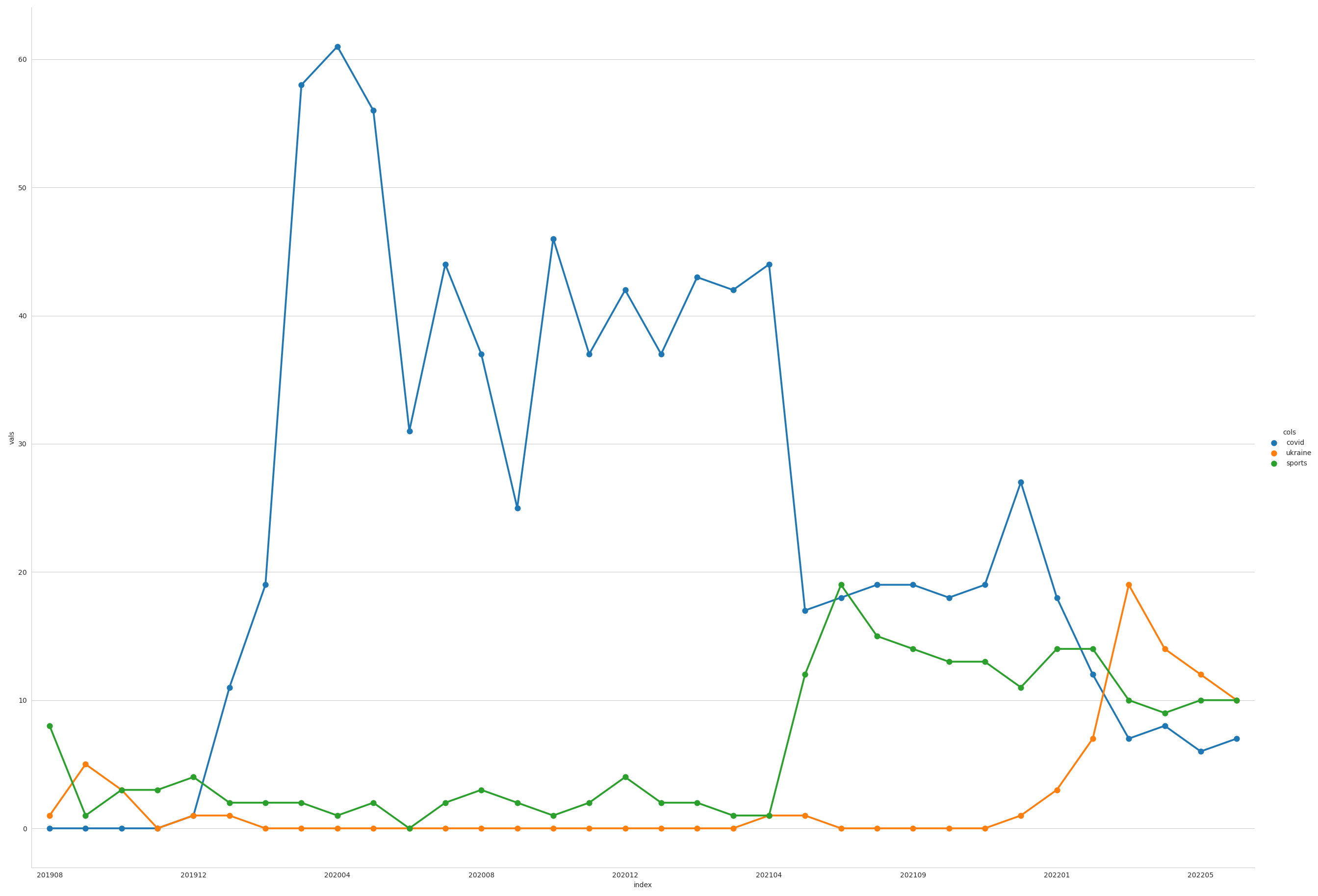
Second, based on the plot shown in my first blog post we can compare different topics for srf.ch. The function above will help you build a line plot comparing three topics on a timeline of news header data for srf.ch. In 2020 I was interested in how Covid would develop in media attention. We can now have a look with data since 2019 and the function below.
def plot_3_topics(dataframe, lineone, linetwo, linethree):
    """
    Plot 3 selected topics by date element

    Args:     df (DataFrame)            --

    Returns:  plot (DataFrame)
    """

    data = dataframe
    line_1 = lineone
    line_2 = linetwo
    line_3 = linethree
    sns.set_style("whitegrid")

    covid_line = data[[line_1, line_2, line_3]].copy()
    covid_line['index'] = covid_line.index
    covid_line = covid_line.melt('index', var_name='cols', value_name='vals')

    sns.catplot(x="index", y="vals",
                hue='cols',
                data=covid_line,
                kind='point',
                height=18.27,
                aspect=11.7 / 8.27)

    plt.gca().xaxis.set_major_locator(plt.MaxNLocator(10))

    plt.show()

plot_3_topics(
    dataframe=df_output_month_perc,
    lineone='covid',
    linetwo='ukraine',
    linethree='sports')

We can see a very steep rise in the first quarter of 2020 - Covid dominating news headlines for the first months. Followed by some more or less stable 45 percent for nearly one year in spring 2021 relative importance decreased very fast to stable 20 percent relative importance of that topic. With sport events starting all over again the topic sports increased quickly. In 2022 Ukraine became an important topic leaving covid and sports behind. None of the topics are dominant any more.
Sports topic examples includes sports like football or events like olympia. Covid topic examples can be accessed from first code box in this blog post. Ukraine topic consists of key words like ‘ukraine’, ‘Selenskyi’ or ‘mariupol’. The full dictionaries are much longer and very detailed.
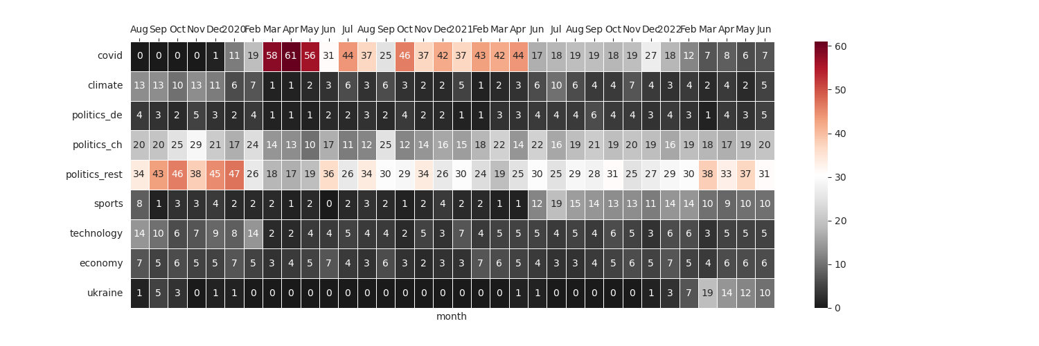
To make the dominance of one topic more visible we can use the heatmap plot below - over topics and time for the news headers of srf.ch since 2019. All topics are just examples and based on a huge list of single keywords and phrases per topic.
fig, ax = plt.subplots(figsize=(15, 5))
cmap = sns.diverging_palette(240, 10, n=9, as_cmap=True)
cmap = sns.color_palette("rocket", as_cmap=True)
cmap = sns.cubehelix_palette(start=.5, rot=-.75, as_cmap=True)
cmap = sns.light_palette("seagreen", as_cmap=True)

sns.heatmap(df_output_month_perc.transpose(), cmap='RdGy_r', linewidths=0.5, annot=True, fmt='g')

ax.xaxis.tick_top()
xticks_labels = ['Aug', 'Sep', 'Oct', 'Nov', 'Dec',
                '2020', 'Feb', 'Mar', 'Apr', 'May', 'Jun', 'Jul', 'Aug', 'Sep', 'Oct', 'Nov', 'Dec',
                '2021', 'Feb', 'Mar', 'Apr',        'Jun', 'Jul', 'Aug', 'Sep', 'Oct', 'Nov', 'Dec',
                '2022', 'Feb', 'Mar', 'Apr', 'May', 'Jun']

plt.xticks(np.arange(len(xticks_labels)) + .5, labels=xticks_labels)
plt.show()

This Blog post showed a very easy way to crawl news data, to process and to visualize it. We found some interesting insights on how some topics dominate media for a long period while others do not become dominant over time. All of this can be adapted for any website and interest. If you want to go further I encourage you to read my guide to a completely free workflow from data to Google Spreadsheets and Tableau Public to automate self updating interactive Dashboards.
Thank you, and have a beautiful day!