While having no clue about a global pandemic about to start just 6 months later I started to build a web crawler on srf.ch news headlines. Initially I was curious about the topics srf.ch is about to post every day, so I decided to save the headlines and see what I can process and visualize after a year. Then covid-19 came and dominated news rapidly, what we will see in the final plots of this blog post.
Title Image by: Raphael Schaller on Unsplash
In the following short introduction to the topic I want to show how easy news headlines can be crawled, present approaches to data preparation and to produce a plot that is annotated with important events. I know about the phrase yesterday’s news but sometimes it can present interesting data to play around with.
 Photo by Martin Sanchez on Unsplash
The Crawler
The crawler project is build on very basic R scripts and executed once a day by windows task manager. The tokenization, text processing and visualization are based on pandas, nltk and matplotlib. First I want to share the inital crawler and how to get information from html pages on the web, in this case srf.ch. Schweizer Radio und Fernsehen SRF (English: Swiss Radio and Television) is a Swiss broadcasting company. The new business unit of SRG SSR, became the largest electronic media house of German-speaking Switzerland. About 2,150 employees work for SRF in the four main studios in Basel, Bern and Zürich. Thanks to fees, SRF works independently of economic or political interest groups. Journalistic quality has top priority. In this way, SRF serves the cohesion of society and mutual understanding.
When you have a look on the underlying html structure of the website you decide which elements you wish to extract. I’m focussing on the href property of the hyperlinks to extract the headlines.

library(rvest)
library(xml2)
library(curl)
library(plyr)
library(readxl)
library(ggplot2)
library(lubridate)
library(stringr)
library(DataCombine)

url <- "https://www.srf.ch"
html <- paste(readLines(url), collapse="\n")
matched <- str_match_all(html, " href=\"(.*?)\"")                #hyperlinks
date    <- str_match_all(html, " data-date-published=\"(.*?)\"") #dates
links <- matched[[1]][, 2]

links_frame <- as.data.frame(links) %>% mutate(links=as.character(links)) %>% mutate(date=Sys.Date())

links_news     <- grepl.sub(data = links_frame, pattern = "/news/", Var = "links")
As a result you will get the news headlines crawled from srf.ch. The data will look like this and is ready to be processed.

The Processing
After running the short R script from above we have all the news headlines from srf.ch. We can store them in a format we like, build an automatic script run in a tool we prefer and stack one dataframe after another day by day to build up a collection of news data. I chose windows task manager but there are serveral tools for all platforms. A year after I started the crawling process I was wondering, what I could learn from the data collected. This year I’m focussing on Python, so for processing and visualizing the data I hit the switch from R to Python. As mentioned above the code is very simple, you can easyly switch back and perform all transformation and plotting in R if you like. First thing to do after importing some packages is to read the crawled data so that you have everything ready in pandas dataframe.
import pandas as pd
import sys
import nltk
import texthero as hero
from nltk.corpus import stopwords
import matplotlib.pyplot as plt

# Read the data in
df_covid_stats = pd.read_csv('srf_data_all.csv')
df=df_covid_stats[['links','date']].copy()
Next thing is tokenization and exploding tokens to have long data. Afterwards I eliminate german stop words and build a list to remove some trash from my tokens.
# tokenize data
df['links']=df['links'].str.replace('-', ' ', regex=True)
df['tokenized_sents'] = df.apply(lambda row: nltk.word_tokenize(row['links'], language='german'), axis=1)

# explode tokens
df_long=df.explode('tokenized_sents')

# remove stop words and other trash
df_long['tokenized_sents'] = hero.remove_stopwords(df_long['tokenized_sents'])
stop = stopwords.words('german')
df_long['tokenized_sents']= df_long['tokenized_sents'].apply(lambda x: ' '.join([word for word in x.split() if word not in (stop)]))

searchfor = ['https',':']
df_long=df_long[~df_long.tokenized_sents.str.contains('|'.join(searchfor), regex= True, na=False)]

# final data prep
df_long = pd.merge(df_long, df, left_index=True, right_index=True)
df_long=df_long[['tokenized_sents_x','date_x']]
Last step for this easy to perform data processing is to filter for characteristic tokens like ‘corona’ or ‘virus’. I generated the list from a value count, which is easy in this case, cause corona is dominating the dataset, all news headers and summed up tokens.
# corona data
searchfor = ['corona', 'virus', 'sars','covid','pandemie']
df_corona=df_long[df_long.tokenized_sents_x.str.contains('|'.join(searchfor), regex= True, na=False)]
df_corona['count']=1
df_corona=df_corona[['count','date_x']].copy()
df_corona=df_corona.groupby(['date_x']).sum()
df_corona['news']='corona'
df_corona.rename(columns={'count':'corona'}, inplace=True)
The resulting dataframe will look like this and is ready to be used for visualization.

In the last part of this blog we use some matplotlib to see when srf news is jumping on the corona bandwagon. It’s also interesting for how long corona news will dominate the timeline and what other important topics will appear. (It’s NOT the economy, stupid!) You can repeat the last step from above to include all the topics you can see in the plot below.
The Visualization
We imported matplotlib already, so we can start to build our time series plot. I limited the ticks and pushed the legend outside the box for design purposes. Last thing to do was to look up some interesting outliers and maximum values for all analyzed topics. I added annotation labels for all important events that we can see in peaks for every topic.
plt.figure()
plt.ylim(0, 100)

ax=df_tot.plot()
ax.xaxis.set_major_locator(plt.MaxNLocator(10))

# Add labels to the plot
style_election = dict(size=7, color='orange')
style_corona = dict(size=7, color='blue')

ax.text('2020-01-01', 35, "first corona", **style_corona)
ax.text('2020-01-01', 33, "deaths china", **style_corona)

ax.text('2019-10-24', 60, "Swiss federal", **style_election)
ax.text('2019-10-24', 58, "election", **style_election)


ax.legend(loc='upper center', bbox_to_anchor=(0.5, 1.2),
          ncol=3, fancybox=True, shadow=False)

ax
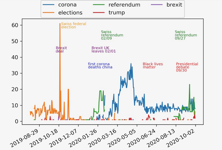
As a result we can look at the plot below.

Interesting is, that as a national news chanel SRF concentrated on a national election for quite a long time. Brexit agreement and execution peaked but Brexit was no long term topic. Around the turn of the year none of the selected topic dominated, SRF is making news on several national and regional topics. This is something you would expect everytime apart voting seasons. This year even silly season was overtaken by the pandemic. You can see dominating direct democratic referendums in early 2020 and late 2020. Trump is a backround noise topic, peaking with black lives matter and the first presedential debate some days ago. Corona comes into play with the second Chinese dying from the disease in late January 2020. After that Corona dominated almost every day only topped by the very important referendum in September 2020. Let’s see what’s happening with the upcoming US election and a possible flare up of infection rates in the last quarter of 2020. This might lead to similar headline peaks we can see in April 2020.
This Blog post showed a very easy way to crawl news data, to process and to visualize it. This can be adapted for any website and interest. If you want to go further I encourage you to read my guide to a completely free workflow from data to Google Spreadsheets and Tableau Public to automate self updating interactive Dashboards.
Thank you, and have a beautiful day!