To find useful data for modeling metrics that really are part of my life, I decided to order the recordings from my Withings Steel HR smartwatch and to have a look what I’m able to do with the raw data. I’m sure you can download the data of your fitness tracker. Depending on the format you receive you will have to do some different data preparation to get useful data for further analysis.
Title Image by: Nikita Kostrykin on Unsplash
Data Collection and Preparation
First I picked up the collection of the steps I made with my Withings Smartwatch from a csv-file Withings sent me. As I mentioned I have to process the data, what I want to show you in the first part of this blog. I hope this encourages you, to gain more insights from the data all the smart tools collect all day long.
In case of Withings the sent csv of my steps recorded looked like this.

import pandas as pd
import seaborn as sns
import matplotlib.pyplot as plt

path="raw_tracker_steps.csv"
df = pd.read_csv(path)

df['value'] = df['value'].str.replace('[','')
df['value'] = df['value'].str.replace(']','')
df['value'] = df['value'].str.split(',')
df_samp=df[['start','value']]
df_samp['value']=list(df['value'])
df_samp=df_samp.explode('value')

df=df_samp.copy()
Data Processing with the steps nested inside a list inside the cell of our data frame is a bit tricky here. The list is not represented correctly so I use a hotfix to replace square brackets, then split the data and make it a real list afterwards. It looks all the same in the dataframe cell, but afterwards we can explode the list. When we explode the list we have every steps element in one row connected to a specific datetime field for further processing in a long data frame format.
df['date'] = df['start'].str.split('T').str[0]
df['time'] = df['start'].str.split('T').str[1]
df['time'] = df['time'].str.split('+').str[0]
df['date'] = pd.to_datetime(df['date'], format='%Y-%m-%d')

df['weekday'] = df['date'].dt.dayofweek
df['month'] = df['date'].dt.month
df['day'] = df['date'].dt.day
df['value'] = pd.to_numeric(df['value'])

df_day=df[['date','value']]
df_day=df_day.groupby('date').sum()
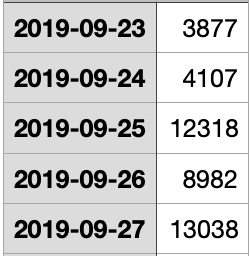
After the transformations done your my data looks like this. The grouping is by day but with the information derived from the date you can also group by month or weekday.

Last part is the date transformation to gather date and time and to derive weekday, month and day for upcoming data analysis. Although not the focus of this blog post, we can analyze the steps grouped by weekdays to see, if we on average are more active on mondays or in holidays compared to office days. That’s the fun part of having raw data and the ability to build your own graphs and dashboards. Withings only shows you what they find is useful and interesting to you.
 Photo by Bruno Nascimento on Unsplash
Google Spreadsheets
Next step is all about Google Spreadsheets and the connection to Python and later Tableau Public. To be honest I had to cheat and follow a great step-by-step guide I found here: MEDIUM. Since Tableau Public Public is able to connect to Google Spreadsheet as a Server data source and is able to update Tableau workbooks once a day Google Spreadsheet is despite all data protection consideration my top pick for a completely free updating workflow. In case of Google free means, that you pay with the data you upload, so please be careful with sensitive data. (Google still knows how much steps I make, same to Apple)
You need a Google Account plus an empty spreadsheat you create on your account and we get started. As an introduction please read the beginning of the analytics vidhya post and follow all steps for authorization and configuration of your Google Account. In this blog I start with the workflow in Python, everythings to set up before is in the great step-by-step guide on MEDIUM I recommend to read carefully.
In the next code snippet don’t forget to change ‘SAMPLE_SPREADSHEET_ID_input’ to the value of your newly created Google Spreadsheet (see MEDIUM).
import pandas as pd
from googleapiclient.discovery import build
from google_auth_oauthlib.flow import InstalledAppFlow,Flow
from google.auth.transport.requests import Request
import os
import pickle

SCOPES = ['https://www.googleapis.com/auth/spreadsheets']

# df_gold comes from the tutorial mentioned above
# no changes to that, so you can walk through with the same settings

df_gold=df_day.copy()
df_gold.reset_index(level=0, inplace=True)
df_gold['date']=df_gold['date'].astype(str)
print(df_gold)

#change this by your sheet ID
SAMPLE_SPREADSHEET_ID_input = 'AAAAAAAAAAAAAA-BBBBBBBBBBBBBBBBBB'
We start with our ‘df_day’ that stores the steps I made and copy it to ‘df_gold’ (the name from analytics vidhya). The date field is gathered from the index, date has to be a string to be pickled to JSON.
In the next code snippet don’t forget to change the name of ‘credentials.json’. This is the configuration JSON you hopefully downloaded from Google and saved in the same folder as your final Python script. Otherwise please walk through the instructions in MEDIUM.
#change the range if needed
SAMPLE_RANGE_NAME = 'A1:AA1000'

def Create_Service(client_secret_file, api_service_name, api_version, *scopes):
    global service
    SCOPES = [scope for scope in scopes[0]]
    #print(SCOPES)

    cred = None

    if os.path.exists('token_write.pickle'):
        with open('token_write.pickle', 'rb') as token:
            cred = pickle.load(token)

    if not cred or not cred.valid:
        if cred and cred.expired and cred.refresh_token:
            cred.refresh(Request())
        else:
            flow = InstalledAppFlow.from_client_secrets_file(client_secret_file, SCOPES)
            cred = flow.run_local_server()

        with open('token_write.pickle', 'wb') as token:
            pickle.dump(cred, token)

    try:
        service = build(api_service_name, api_version, credentials=cred)
        print(api_service_name, 'service created successfully')
        #return service
    except Exception as e:
        print(e)
        #return None

# change 'my_json_file.json' by your downloaded JSON file.
Create_Service('credentials.json', 'sheets', 'v4',['https://www.googleapis.com/auth/spreadsheets'])

gsheetId=SAMPLE_SPREADSHEET_ID_input
def Export_Data_To_Sheets():
    response_date = service.spreadsheets().values().update(
        spreadsheetId=gsheetId,
        valueInputOption='RAW',
        range=SAMPLE_RANGE_NAME,
        body=dict(
            majorDimension='ROWS',
            values=df_gold.T.reset_index().T.values.tolist())
    ).execute()
    print('Sheet successfully Updated')

Export_Data_To_Sheets()
Now all the data is saved to your Google Spreadsheet and ready to be connected with Tableau Public what we will see in the next step.
Tableau Public
Tableau is a leading tool when it comes to Dashboarding and Visualization. I use it since 6 years, mainly to build market research dashboards but now I want to show you how to utilize Tableau Public to visualize data coming from Google Spreadsheets. Tableau Desktop (Public) is a free tool you download from Tableau Public, add your own account and get started. As mentioned in the Google Spreadsheets section: same with Tableau Public. You pay with the data you upload to their platform, so be careful with sensitive data.
When the installation process is finished and you have your free profile on Tableau Public you can start to connect the Google Spreadsheet you built in the previous steps. You select connection to a server and then to Google Spreadsheets. In the dialog select your Google account and work your way thru to your saved Google Spreadsheets. When you successfully connected Tableau Desktop to your Google account you can select a Google Spreadsheet in the Tableau Desktop dialog.

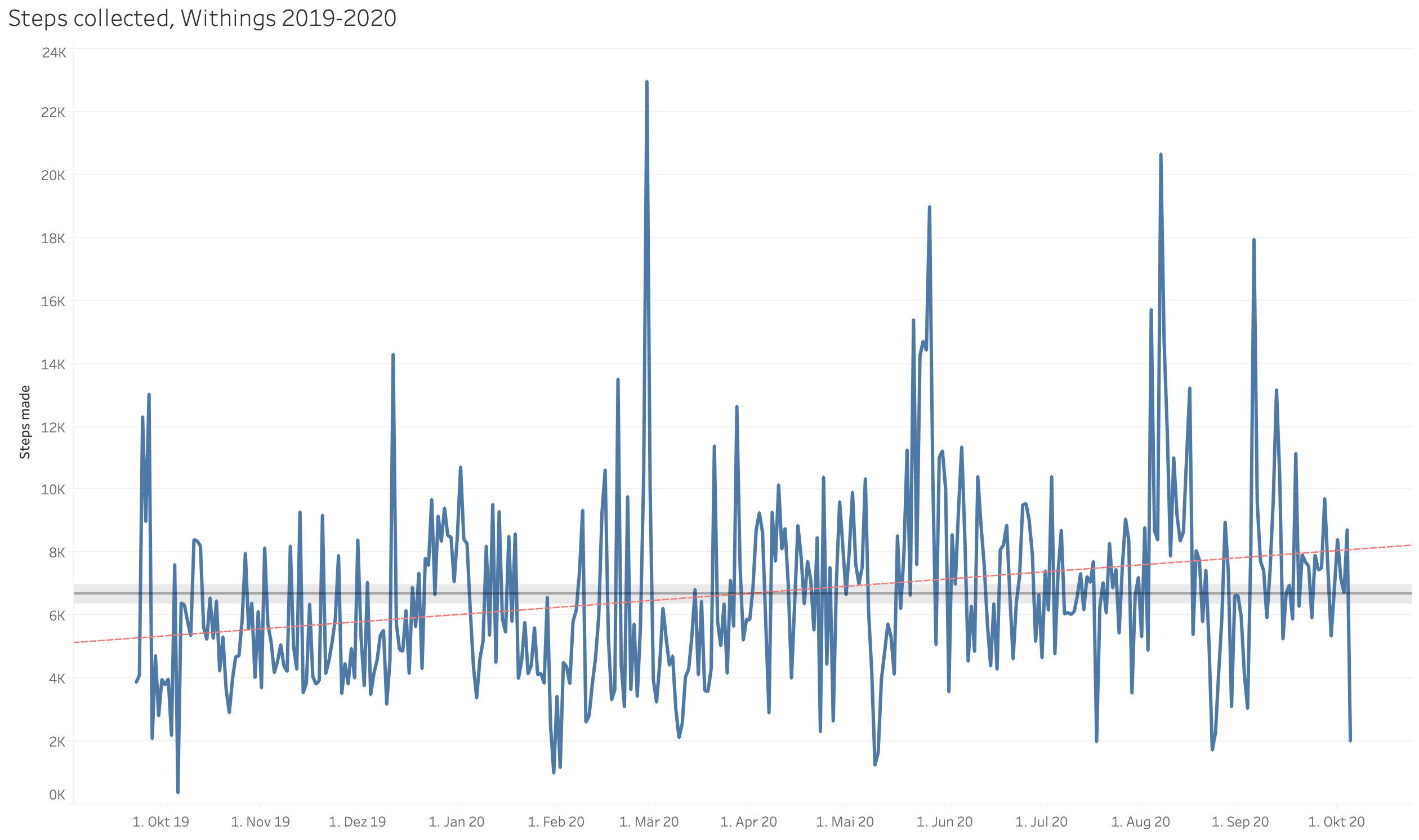
Next is the configuration of the Visualization. For the purpose of this Blog I keep it simple, click on the date field and the value field and select an automatic timeline visualization. I add a trendline from the Analytics pane and an average with confidence interval. You can see, that my steps are increasing slightly during the measuring period, good work! I save my workbook and publish it to my Tableau Public Account. Google authorization is needed, the Tableau workbook is now connected with the Tableau Public Platform and with Google Spreadsheets as data source. Tableau Desktop opens the web browser, you can edit the name and properties of your published visualization and importantly select to update the data source once a day.
In Tableau Public the final Dashboard looks like this. It’s interactive! Play around with the dates and see what happens when you group them differently.
Now your done, the workbook published to your Tableau Public Account is updated from the underlying Google Spreadsheet, which is filled automatically by your Python Script from the steps above. If you want to go further I encourage you to read my guide to simple webcrawling and simple text processing and to input the data from your crawler to the Google Spreadsheet and Tableau Public workflow. Dashboards.
Thank you, and have a beautiful day!